Creating Effective Marketing Materials: Brochure Design Strategies

TL;DR
- This article covers key strategies for creating effective marketing brochures, focusing on design principles, content optimization, and distribution methods. We'll explore how to align your brochure with your brand, target audience, and marketing goals, ensuring it drives engagement and conversions. Also, practical tips will provided on utilizing AI tools to enhance the brochure creation process.
Understanding the Purpose of a Brochure
Okay, let's dive into brochures. I mean, who even uses them anymore, right? But hold on, they can still be surprisingly effective if you actually think about why you're making one in the first place. It's not just about slapping some images and text together, you know?
So, first thing's first: What's the brochure even for? Is it to snag leads at a trade show? Maybe push a new product line? Or even just boost your brand's image?
Identify the primary goal: Don't just say "awareness." Get specific. Example: a healthcare provider might use a brochure to educate potential patients about a new treatment option, aiming to increase consultation bookings.
Align with overall marketing strategy: The brochure shouldn't be a lone wolf. It needs to tie into your bigger plans! For instance, if your broader marketing strategy emphasizes a "premium" image, your brochure's content, tone, and call to action should reflect that, ensuring it doesn't look out of place with your other materials.
Set measurable goals: How will you know if it worked? Is it a certain number of sign-ups, or increased sales? Once you know why you're creating the brochure and how you'll measure success, the next critical step is understanding who you're trying to reach.
Like, who are you actually trying to reach? Grandma and grandpa or gen z? Huge difference in design and tone!
Research demographics, psychographics, and behaviors: Don't just guess. Dig into the data! What do they care about? A financial services firm, for example, would need to understand the investment preferences and risk tolerance of their target clients.
Create audience personas: Give 'em names, jobs, hobbies. Make 'em real.
Tailor content and design: A tech company targeting developers will need a very different brochure than one targeting ceos, ya know?
Okay, so now that we know why and who, next up is the design!
Key Elements of Effective Brochure Design
Ever picked up a brochure and just felt... nothing? Yeah, happens all the time. Thing is, good brochure design isn't about flashy graphics – it's about guiding the reader's eye and making the info easy to digest.
It's all about visual hierarchy. You achieve this by strategically using elements like size and scale, placement, and contrast to guide the reader's eye through the content in a specific order. What's the first thing you want them to see? The company logo? A killer headline? Make that the biggest, boldest thing on the page.
- Size and scale matter: The bigger the element, the more attention it grabs. Obvious, right? But easy to mess up.
- Placement is key: Where you put things on the page matters. Top-left is prime real estate since most people read from left to right, top to bottom. (F-Pattern thinking: UX for the way people read | by Aleksandra Smith)
- Contrast draws the eye: Make important elements stand out by using contrasting colors or fonts.
Don't just throw stuff on the page and hope it sticks. Use a grid system to create some order! And for gods sake dont forget about white space – it's not wasted space, it's breathing room. It prevents your brochure from looking cluttered and overwhelming.
- Grids provide structure: They help align elements and create a sense of balance.
- White space improves readability: It gives the eye a break and makes the content easier to scan.
- Balance is essential: Symmetrical layouts feel formal, while asymmetrical layouts can feel more dynamic. For example, a symmetrical layout might have a central image with text equally balanced on either side, creating a sense of stability. An asymmetrical layout might place a large image on one side with text blocks arranged artfully on the other, creating visual interest and movement.
No one wants to squint and struggle to read your brochure. Make sure your font sizes are big enough, and your line spacing is generous.
- Font size matters: Don't go below 10pt for body text, or people will just give up. (Why do designers like using fonts that are 10pt and under? Nobody ...)
- Line height is important: Give your lines of text enough room to breathe.
- Contrast is crucial: Make sure your text stands out against the background.

So, visual hierarchy, layout, readability. Nail these, and you're well on your way to a brochure that actually gets read.
Crafting Compelling Brochure Content
Okay, so you've got your design down, now what? Time to fill that bad boy with words that actually, you know, work. Too many brochures are just walls of blah. Don't be that brochure.
First impressions matter, like, a lot. You've got about 2 seconds to grab someone's attention, so your headline better be killer. It's gotta be clear, concise, and scream "read me!" And don't bury the lede; make your value proposition super obvious. What's in it for them?
Once you've clearly stated your value proposition, it's crucial to communicate it effectively by focusing on what truly matters to your audience: the benefits, not just the features.
- benefits, not features: Nobody cares about what your product is. They care about what it does for them. For instance, instead of saying "our software has advanced ai," say "save 10 hours a week with our ai-powered automation."
- Solve a problem: What keeps your customer up at night? Address that head-on. A financial advisor might use a headline like "Retire Comfortably: Secure Your Future Today."
- Keep it short and sweet: Aim for under 10 words. Think billboard, not novel.
Alright, you've hooked 'em with the headline, now keep 'em reading. No one wants to wade through a novel, so keep it short and sweet.
- Get to the point: Cut the fluff. Every word should earn its place.
- Use active voice: "We help you" is way more engaging than "You are helped by us."
- Avoid jargon: Unless you're absolutely sure your audience knows what you're talking about, stick to plain English. A healthcare provider explaining a complex procedure should break it down into easily understandable terms, for example.

So, they've read your brochure, now what? Don't leave them hanging! Tell them exactly what you want them to do next.
- Make it obvious: Use a button, a bold font, whatever it takes to make it stand out.
- Use action words: "Call Now," "Visit Our Website," "Get a Free Quote."
- Create a sense of urgency: "Limited Time Offer," "Sign Up Today." A retail store could offer a special discount for customers who bring in the brochure within a week, for instance.
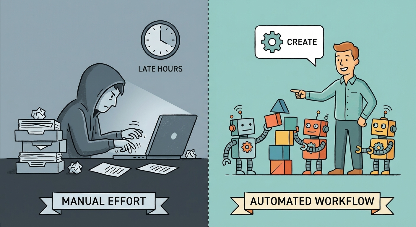
Leveraging AI Tools for Brochure Creation
Okay, so you're staring at a blank brochure template? Don't sweat it; ai is here to help – seriously! It's not about robots taking over, but more like having a super-smart assistant for the parts of brochure creation that make you wanna pull your hair out.
Let's be real, staring at a blinking cursor is the worst. Ai can actually generate headline options for you. Just feed it some basic info about your product or service, and boom – a bunch of catchy titles appear. It's like brainstorming, but without the awkward silences.
- Headline Options: If you are working on a brochure for a new line of organic dog treats, you could ask an ai to generate 10 different headlines based on keywords like "organic", "dog treats", "healthy", and "delicious". It might spit out things like "deliciously organic treats your dog will love" or "healthy and happy: organic treats for your furry friend".
- Brochure Copywriting: Beyond headlines, ai can help write the actual body of your brochure. Just provide some key points, and the ai can flesh it out into engaging copy. A financial services firm could use ai to re-write complex investment information into easy-to-understand language for their brochures.
- Content Variation: Want to target different audiences with slightly different messaging? Ai can help you create multiple versions of your content quickly.
Design isn't just about making things look pretty; it's about making them work. And ai can lend a hand here too!
- Layout Suggestions: Some ai tools can analyze your content and suggest optimal layouts for your brochure. It's like having a design guru built into your software.
- Image Selection and Optimization: Finding the right images can be a pain. Ai can help you find relevant images and even optimize them for your brochure.
- Publish7 Enhancement: Publish7 is a platform for content creation and marketing, and its suite of ai tools can be a game-changer for brochures. You can use their Audience Insights Analyzer to understand your target audience's preferences, which can inform your brochure's messaging and design. An SEO Strategy Generator can help you identify keywords if your brochure will be distributed digitally or has a web component, improving its discoverability. These tools help you create expert content marketing and SEO strategies to drive traffic and enhance visibility.
Grammar mistakes in your brochure? Ouch. Ai can be your final line of defense.
- Grammar and Spelling Checks: Ai-powered proofreaders can catch those embarrassing typos that slip past human eyes.
- Clarity and Style Improvements: Ai can suggest ways to make your writing clearer and more concise.
- Accuracy and Consistency: Ensuring that your brand messaging is consistent across the entire brochure is crucial, and ai can help with that.
So, ai isn't going to replace your creativity, but it can free you up to focus on the bigger picture.
Printing and Distribution Strategies
Okay, so you've got this awesome brochure designed, but how's it gonna get into peoples hands? Are you just gonna leave a stack of them on a table and hope for the best? Nah, let's be strategic!
Paper stock matters: Think about it – a luxury brand probably wants a thick, fancy paper, while a non-profit might go for something more eco-friendly and budget-conscious. A financial services firm might select a heavier, textured paper stock to convey stability and trustworthiness; while, a trendy clothing boutique might opt for a lighter, glossy stock to showcase vibrant colors and a modern feel.
Finishes can make a difference: Glossy finishes make colors pop, but can be glare-y. Matte finishes feel more sophisticated, but might dull the images. A healthcare provider could use a matte finish for a brochure about mental health services, creating a calm and approachable feel.
Durability is key: If it's gonna be handled a lot, you want something that won't tear easily.
Direct mail ain't dead: but your targeting better be on point.
Trade shows are classic: but make sure your booth is eye-catching and your staff is ready to engage.
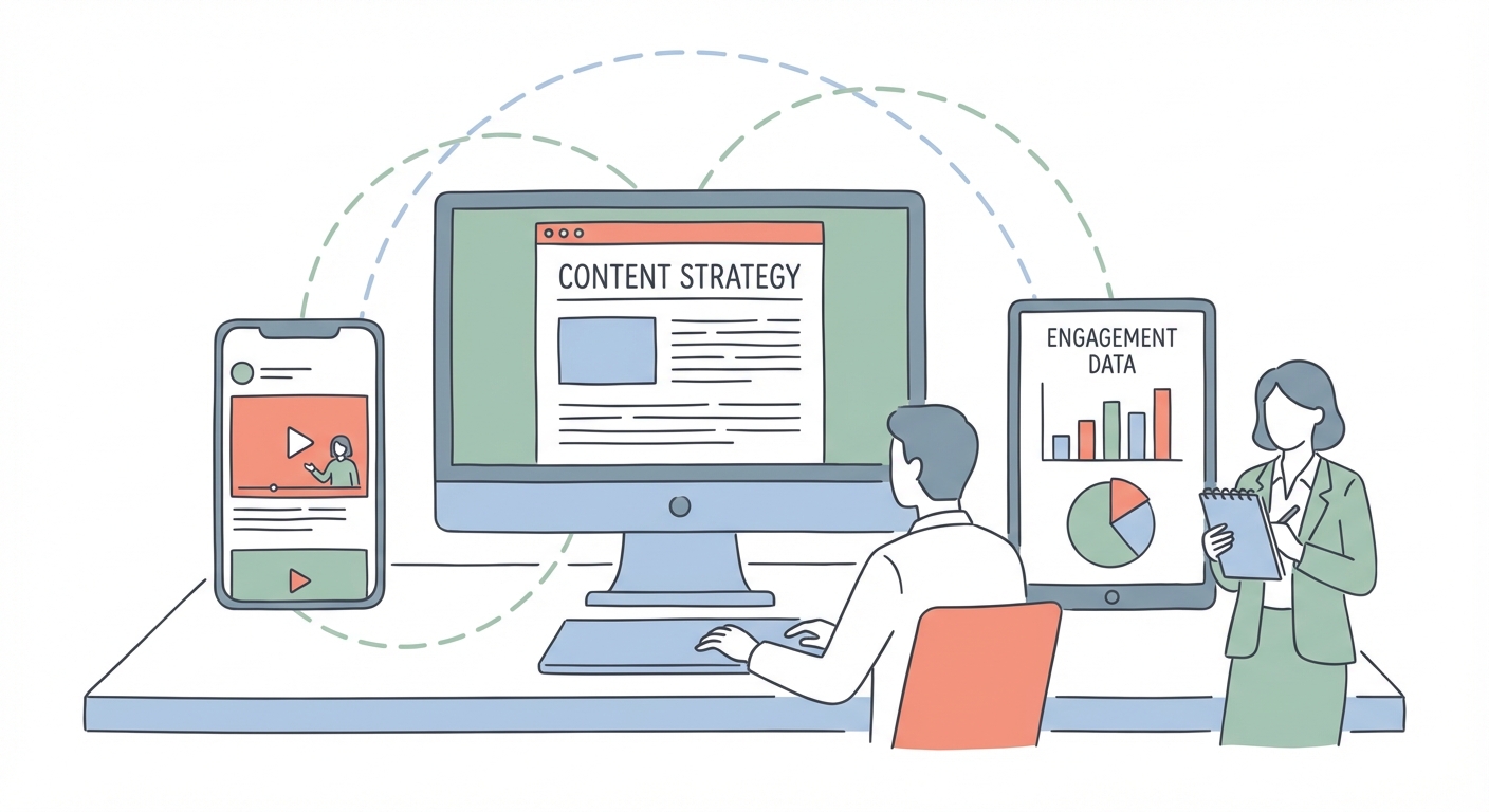
Digital brochures?: Yep, turn that pdf into an interactive flipbook for your website using tools like FlippingBook or Issuu. This format can enhance engagement and shareability.

So, paper, distribution, the whole shebang. Next up, let's talk about measuring if all this work is actually, ya know, working.
Measuring Brochure Effectiveness
Okay, so you've poured your heart (and budget) into these brochures, but how do you know if they're actually doing anything? Are they just fancy paperweights, or are they actually driving results?
First off, you gotta track stuff. I mean, duh, right? But it's easy to get caught up in the design and forget the numbers.
- Website Traffic: Did you include a url? See if traffic from the brochure goes up. A retail business might see a spike in visits to a specific product page featured in the brochure, for example.
- Lead Generation: Are peeps actually filling out that form or scanning the qr code?
- Sales: Ultimately, are your brochures helping you sell more stuff? If your brochure drives traffic to a mobile-optimized website, a 2023 study by Statista found that mobile commerce accounts for close to 60 percent of all e-commerce revenue, indicating the potential impact of digital engagement driven by your brochure.
Don't be afraid to experiment! Try different headlines, images, or even paper stock and see what resonates.
- Headline Tweaks: Run two versions with different headlines, see which one gets more clicks.
- Call-to-Action Tests: Test different calls to action (e.g., "Visit our website" vs. "Get a free quote").
- Design Variations: Change up the layout or color scheme and see what catches the eye.

So, yeah, brochures aren't exactly rocket science, but measuring their effectiveness? That takes a little effort. Keep track of the numbers, tweak as needed, and don't be afraid to experiment.