Defining Call to Action in Content Marketing


TL;DR
- This article covers the core definition of a call to action (CTA) within content marketing, exploring its different forms and importance. The article includes actionable tips for crafting effective CTAs, and provides several examples of successful CTA implementation across various platforms, focusing on how AI writing assistants can enhance content marketing strategies.
Understanding the Core of Call to Action
Okay, so you're trying to figure out what a call to action really is in content marketing? it's more than just a "buy now" button. its a guidepost, a nudge, a gentle (or not-so-gentle) shove in the right direction.
Definition of a cta: Simply put, it's a prompt. Think of it as a digital tap on the shoulder, designed to get someone to do something. Wrike defines it as "an invitation to the customer to take a specific action". It's not rocket science, but it is pretty crucial.
Purpose of CTAs: To steer people toward a specific goal. Could be buying something, signing up, or just generally engaging with your content. Like, if you're in healthcare, maybe you want them to book a checkup. Or if you're in retail, perhaps you want them to download a coupon.
Cta's Role in Content Marketing: It's the engine that drives engagement, lead generation, and conversions. Without a clear cta, your content is just... there. While the exact quote is hard to verify, the idea is that CTAs are the crucial next step that moves potential customers further down the funnel. Think of it as the "so what?" of your content.
CTAs as Conversion Drivers: Direct impact on conversion rates. no cta? no conversions. it's that simple. A well-placed cta can turn a casual browser into a paying customer. For instance, imagine a finance blog offering a free consultation – that cta is the bridge between reading and doing.
Guiding the User Journey: CTAs are like breadcrumbs, guiding users through the sales funnel. "learn more," "download now," "contact us"—each one moves them closer to the ultimate goal. It's about leading them by the hand, not just throwing information at them.
Measuring cta Effectiveness: It's not enough to just have a cta; you need to know if it's working. Link your CTAs to analytics to track clicks, conversions, and overall performance. Tools like Google Analytics can help with this by tracking user interactions. You can implement this using things like UTM parameters on your links or setting up event tracking for button clicks. That way, you can tweak and optimize for better results.
So, what's next? Now that we've defined what a cta is, let's dive into the different types of CTAs and when to use them.
Types of CTAs and When to Use Them
Alright, so we know what a CTA is, but not all CTAs are created equal, right? They serve different purposes and work best in different situations. Think of it like having the right tool for the job.
Transactional CTAs: These are your direct-response CTAs. They're all about getting someone to complete a specific transaction, like buying a product, signing up for a service, or making a donation. You'll see these a lot on e-commerce sites ("Add to Cart," "Buy Now") or when someone's ready to commit to something ("Sign Up Today," "Donate Now"). Use these when the user is clearly ready to take that final step.
Informational CTAs: These are for when you want to educate your audience or get them to learn more. Think "Learn More," "Read Our Blog," "Download the Guide," or "Watch the Webinar." These are great for the top and middle of the sales funnel, where you're building awareness and interest. For example, a software company might use "Download Our Free Ebook" to capture leads who are researching solutions.
Navigational CTAs: These help users move around your website or platform. Examples include "Go to Homepage," "View All Products," or "Contact Us." They're essential for user experience, making sure people can find what they're looking for without getting lost. You'll find these sprinkled throughout your site, often in headers, footers, or sidebars.
Lead Generation CTAs: These are specifically designed to capture contact information from potential customers. "Sign Up for Our Newsletter," "Get a Free Quote," or "Request a Demo" fall into this category. They offer something of value in exchange for an email address or other contact details, helping you build your marketing list.
Engagement CTAs: These encourage interaction with your content or brand. "Share This Post," "Leave a Comment," or "Follow Us on Social Media" are common examples. They're great for building community and increasing brand visibility. You might see these at the end of blog posts or on social media updates.
Understanding these different types helps you choose the right CTA for the right moment, making your marketing efforts way more effective.
Crafting Effective CTAs: Key Elements and Strategies
Okay, so you're trying to nail down those CTAs, huh? It's not just about slapping a button on your page; it's about makin' it count. Think of it as the secret sauce that turns browsers into buyers.
Words matter, big time. You can't just say "click here" and expect magic to happen. You gotta use words that get people pumped to click. Think strong verbs like "Buy," "Download," or "Subscribe." These words tells people exactly what to do, no guesswork needed.
The power of strong verbs can't be understated. For example, instead of "Learn more about our services," try "Discover how our services can transform your business." See the difference? The first is passive; the second is like a shot of espresso.
Creating a sense of urgency is key. Add time-sensitive language like "Now," "Today Only," or "Limited Time Offer." it's like telling your audience, "Hey, this is important and might not be here tomorrow!" For instance, a retail store might use a cta like "Shop Now and Get 50% Off – Offer Ends Tonight!" this pushes people to act fast, or they'll miss out.
Conciseness is king. Aim for clear, short phrases that are easy to understand. Nobody wants to read a paragraph just to figure out what to do next. "Download Now," "Get Started," "Sign Up Free"—these are winners.
A great cta is useless if nobody sees it, right? Design and placement is everything. It's about making that button or link as eye-catching as possible.
Visual prominence is key. Use color, size, and contrast to make your cta stand out. Think about it – a bright orange button on a blue background is gonna grab way more attention than a gray button on a white background. This works because contrasting colors create a strong visual hierarchy, drawing the eye naturally to the most important element. you want that cta to basically scream, "click me!"
Strategic placement matters. Consider where your ctas will have the most impact. Try placing them at the end of blog posts, within email newsletters, or on product pages. Test different spots to see what works best. For example, a finance blog might place a "Get a Free Consultation" cta after explaining a complex investment strategy.
Mobile optimization is a must. Make sure your ctas are easily accessible and tappable on mobile devices. Nobody wants to struggle to click a tiny button on their phone.
So, what's next? We'll dive into personalizing your CTAs.
Personalizing Your CTAs
Okay, so we've talked about crafting CTAs that grab attention, but what if we could make them even more effective? That's where personalization comes in. It's about making your CTA feel like it was made just for that specific person.
Tailoring to user behavior: If someone's been browsing your "running shoes" category for a while, a CTA like "Shop Our Latest Running Shoe Collection" is going to hit harder than a generic "Shop Now." You can use website data to show dynamic CTAs that change based on what a user has viewed or interacted with.
Leveraging demographic data: If you know your audience is primarily young professionals, your CTAs might use language that resonates with their career goals or lifestyle. For example, instead of "Sign Up," you might use "Boost Your Career" or "Unlock Your Potential."
Using past purchase history: For returning customers, a CTA like "Reorder Your Favorite Coffee Beans" or "Shop New Arrivals in Your Size" is much more relevant and likely to convert than a general promotion.
Contextual relevance: A CTA at the end of a blog post about "improving sleep" should be different from one on a product page for a mattress. The first might be "Read Our Guide to Better Sleep," while the second could be "Find Your Perfect Mattress."
Personalization makes your CTAs feel less like a sales pitch and more like a helpful suggestion, which, let's be honest, is way more likely to get people to click.
Examples of High-Converting CTAs in Content Marketing
Ever wonder how those clicky buttons and links get you to actually click? It's more than just luck, trust me. There's a whole lotta psychology baked into those little digital nudges.
First up, website CTAs. These are the bread and butter of, well, any website tryin' to do somethin'. E-commerce sites are all about "Add to Cart" or "Shop Now" – get 'em spendin' ASAP! Service businesses? Think "Get a Quote" or "Book a Consultation." And subscription services? They're hookin' you with "Start Your Free Trial" or "Subscribe Today."
Take a healthcare provider, for instance. Instead of a generic "Learn More," they might use "Schedule Your Annual Checkup." It's direct, addresses a need, and gets right to the point. (Clarity & Directness) No fluff.
Or, in retail, a clothing brand could ditch the plain "View Details" and go with "See the Full Collection – Limited Stock Available!" That urgency, man, it works. (Scarcity & Urgency)
Social media is a whole different beast, right? You've gotta grab attention FAST. Facebook's all about "Like Our Page" or "Visit Our Website." Twitter's slangin' "Retweet" and "Follow Us." and LinkedIn? "Connect" and "Join Our Group" are the name of the game.
Like, a finance company might post "Download our free guide to retirement planning" and then use the api to track downloads. It's giving something valuable away in exchange for engagement. (Reciprocity)
And a restaurant could run a contest on instagram: "Tag a friend you'd share this with!" to get more eyes on their profile. Simple, effective, and kinda fun. (Social Proof & Engagement)
Email's where you can get real personal, ya know? Promotional emails scream "Claim Your Discount!" or "Shop the Sale!" Newsletters whisper "Read the Full Article" or "Share With Your Network." And webinar invites? "Register Now" and "Save Your Spot" are king.
A SaaS company sending out a webinar invite might add some urgency: "Register Now – Limited Seats Available!" to get people jumpin' on board. (Scarcity & Urgency)
Or, a non-profit sending a thank you email could include a: "Double your impact – donate again!" with a link to their donation page. (Emotional Appeal & Reciprocity)
So, how does this all tie together? Well, it's about knowing your audience and where they are on their journey. It's not about using the same cta everywhere; it's about tailoring the message to the platform and the person.
Next up, we'll talk about leveraging AI writing assistants for CTA optimization.
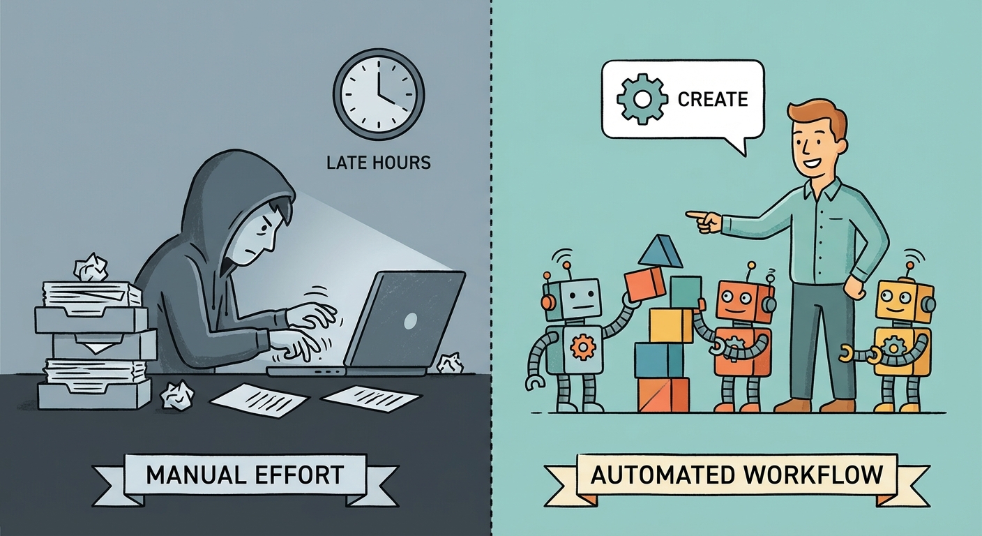
Leveraging AI Writing Assistants for CTA Optimization
Okay, so you're thinkin' about letting AI write your Call to Actions? Sounds kinda futuristic, right? Well, maybe it's not as crazy as it seems.
ai-powered copywriting: Imagine feeding an AI a bunch of successful CTAs and letting it spit out a dozen more variations. That's the idea! You can then A/B test these to see what works best with your audience. For example, instead of "Download Now," the ai might suggest "Grab Your Free Guide" or "Unlock Instant Access." It's about finding the wording that resonates.
Predictive analysis: AI can crunch historical data to predict which CTAs will perform best. Think about it: analyzing past campaigns, ai can identify patterns in language, placement, and even timing that lead to higher click-through rates. In finance, an AI might learn that CTAs emphasizing "secure your future" perform better than those focused on "grow your wealth" with a younger demographic.
Automated personalization: This is where things get really interesting. AI can tailor CTAs to individual users based on their browsing history, demographics, and even real-time behavior. A retail site could show a "Buy Now" cta to a returning customer who's viewed a product multiple times, while showing a "Learn More" cta to a first-time visitor.
overview of ai writing assistants: There's a ton of ai writing assistants out there. Jasper and Copy.ai, for instance, are popular choices. These tools can generate multiple cta options based on a few keywords and parameters you provide. For example, you could input "free ebook download for marketers" into Jasper, and it might suggest variations like "Get Your Marketing Ebook Now," "Download the Ultimate Marketing Guide," or "Unlock Expert Marketing Tips." It's like having a brainstorming partner that never runs out of ideas, even if some of them are a bit... weird.
integrating ai with marketing automation: The real magic happens when you connect these ai tools with platforms like HubSpot and Mailchimp. This allows you to automate the process of generating, testing, and deploying ai-optimized CTAs across your marketing channels. Imagine automatically updating the cta in your email campaign based on real-time performance data—pretty cool, huh?
best practices for ai implementation: Don't just blindly trust the ai! It's important to provide clear instructions, monitor performance, and always, always have a human editor review the ai's suggestions. For example, when instructing an AI to generate CTAs for a new product launch, be specific: "Generate 5 CTAs for a new eco-friendly water bottle. Focus on benefits like sustainability and durability. Avoid overly aggressive sales language." Monitor performance by tracking click-through rates and conversion rates for AI-generated CTAs against human-written ones. Think of the ai as a junior copywriter – it needs guidance to really shine. Make sure you're ethically using these tools; don't try misleading language or false promises, okay? Avoid phrases like "Guaranteed to make you a millionaire overnight" or "Lose 50 pounds in 3 days with no effort."
So, AI can DEFINITELY help with your CTAs, but it's not a magic bullet. It's a tool, and like any tool, it's only as good as the person using it!
A/B Testing and Iterative Improvement of CTAs
Ever wondered if your CTAs are really doing their job, or just sitting there, looking pretty? The truth is, guessing ain't gonna cut it.
You gotta A/B test, plain and simple. A/B testing, also sometimes called split testing, is when you show two different versions of your cta to similar visitors at the same time. Then, you see which one performs better. First, define what you want to improve – more clicks? Higher conversion? Whatever it is, write it down.
Create variations of your ctas. Change the wording, the color, the placement – experiment! For example, a healthcare provider might test "Book Your Appointment Now" against "Schedule Your Checkup Today" and see which one gets more action.
Platforms like Google Optimize, Optimizely, and VWO make this a breeze. These are specialized tools that allow you to easily set up and run A/B tests on your website, showing different versions of your page or elements like CTAs to different segments of your audience and then collecting data on their behavior. It's not about gut feelings; it's about cold, hard data.
Numbers don't lie. Track key metrics like click-through rates and conversion rates to see what's working. Don't just glance at the data; really dig in. What does it mean?
Interpreting the data is key. Did the blue button outperform the green one? Was a more urgent tone more effective? Maybe a finance blog finds that "Secure Your Future" works better than "Grow Your Wealth" for older readers. Who knew?
Implement changes based on the results. If one cta is clearly winning, roll it out across your site. But don't get complacent.
Optimization is a journey, not a destination. Make A/B testing a habit -- seriously, put it on your calendar. The digital world changes fast. What worked last month might not work today.
Stay updated on the latest trends in cta design and messaging. What colors are hot? What words are working? What's the next big thing?
Adapt to changing user behavior. Are mobile users responding differently than desktop users? Tailor your ctas accordingly. Like, a retail site might find that mobile users prefer a simple "Shop Now" button, while desktop users like a more detailed "Explore Our New Collection" message. The digital landscape is constantly evolving due to factors like shifting user preferences, new platform algorithms, and emerging marketing trends.
It's all about constant tweaking and refining, but the payoff is worth it. So get out there, start testing, and watch those conversions soar!