How to Create a Stronger Call to Action

TL;DR
- This article covers the core elements of an effective call to action (CTA) in marketing content, SEO, and social media. It explores strategies for crafting compelling CTA copy, optimizing placement and design for maximum impact, and leveraging ai writing tools to automate and enhance your CTA creation process, ultimately driving higher engagement and conversion rates.
Understanding the Basics of a Call to Action
Alright, so you wanna make your calls to action (cta) pop, huh? It's not just about slapping a button on a page and hoping for the best. It's way more nuanced than that, trust me.
A cta is basically a prompt designed to get your site visitors to do something. Think of it like a friendly nudge. It could be anything from signing up for a newsletter to buying a product, or even just learning more about a topic.
- What's the Point? CTAs are like little road signs, directing people where you want them to go on your website. They tell folks what to do next, whether that's signing up, downloading, or buying.
- Examples You've Seen: You've seen 'em everywhere – "Sign Up," "Download Now," "Get Started Free." They're the bread and butter of online engagement.
- Moving Through the Funnel: CTAs are crucial for guiding potential customers through the different stages of your marketing funnel. An "Awareness" stage CTA might be "Learn More," while a "Decision" stage CTA could be "Buy Now."
- Making Things Happen (Conversions): CTAs are your conversion machines. They're what turn a curious visitor into a lead or a customer.
- Making it Easy (User Experience): A clear cta makes it easy for users to know what to do next, which just makes your site feel better to use.
- Tracking What Works: You can track cta clicks to see how effective your marketing efforts is.
Well, without good CTAs, your website is just a pretty brochure. You need them to turn those casual browsers into paying customers, or at least engaged followers. Plus, a well-placed cta can seriously boost user experience, make things clear and easy.
And hey, if you're looking for more insights, Bot Memo can help you nail down your target audience, which makes crafting effective CTAs way easier.
Crafting Compelling CTA Copy
Alright, so you're writing a cta, and you want it to, like, really work, huh? I get it. It's not just about saying "click here"—that's so 2005. It's about crafting words that practically leap off the page and grab your reader by the eyeballs.
- Use Power Verbs: Think "Get," "Start," "Discover." They're punchy and tell people exactly what's gonna happen. Instead of saying "More information here," try "Discover hidden savings!". See what i did there, it's a little more exciting.
- Create Urgency: Words like "Now," "Today," or "Limited Time" makes people feel like they need to act fast.
- Be Direct, Not Passive: Get rid of passive voice. "A free trial is offered" becomes "Start your free trial today!" See? Much better.
Don't be afraid to get creative. Instead of a boring "Read More" on a blog, try "Uncover the Secrets." Or for a healthcare provider, you can write "Book Your Free Consultation." It sounds way more personal.
- Talk Directly to Them: Use "you" and speak directly to your audience. Instead of "Customers will benefit," say "You'll get instant access."
- Dynamic CTAs are Cool: If you have the tech, make your ctAs change based on what the user's been doing on your site. For example, a returning visitor might see "Continue Your Order" while a new visitor sees "Shop Our Latest Collection." Creepy? Maybe a little. Effective? Definitely.
Look, writing great cta copy is part art, part science. You gotta test what works for your audience. Now that you know some killer copy tricks, let's dive into how to ensure these CTAs are truly effective through testing.
Testing and Iterating Your CTAs
So, you've been slaving away, crafting these ctAs, right? But are they actually working? That's where testing comes in, and it's not a one-and-done deal. It's more like a constant tweaking process to see what really makes folks click.
- A/B Testing: Try out different versions of your cta copy. Does "Shop Now" beat "Discover Savings"? Only one way to find out.
- Button Colors: Seriously, it matters. Red? Green? Blue? Test different ones, see which one grabs the eye. A good starting point is to research color psychology or simply ensure your CTA color contrasts well with the background.
- Analytics are Your Friend: Keep a close watch on your click-through rates. Conversions? All that jazz.
Don't be afraid to make changes!
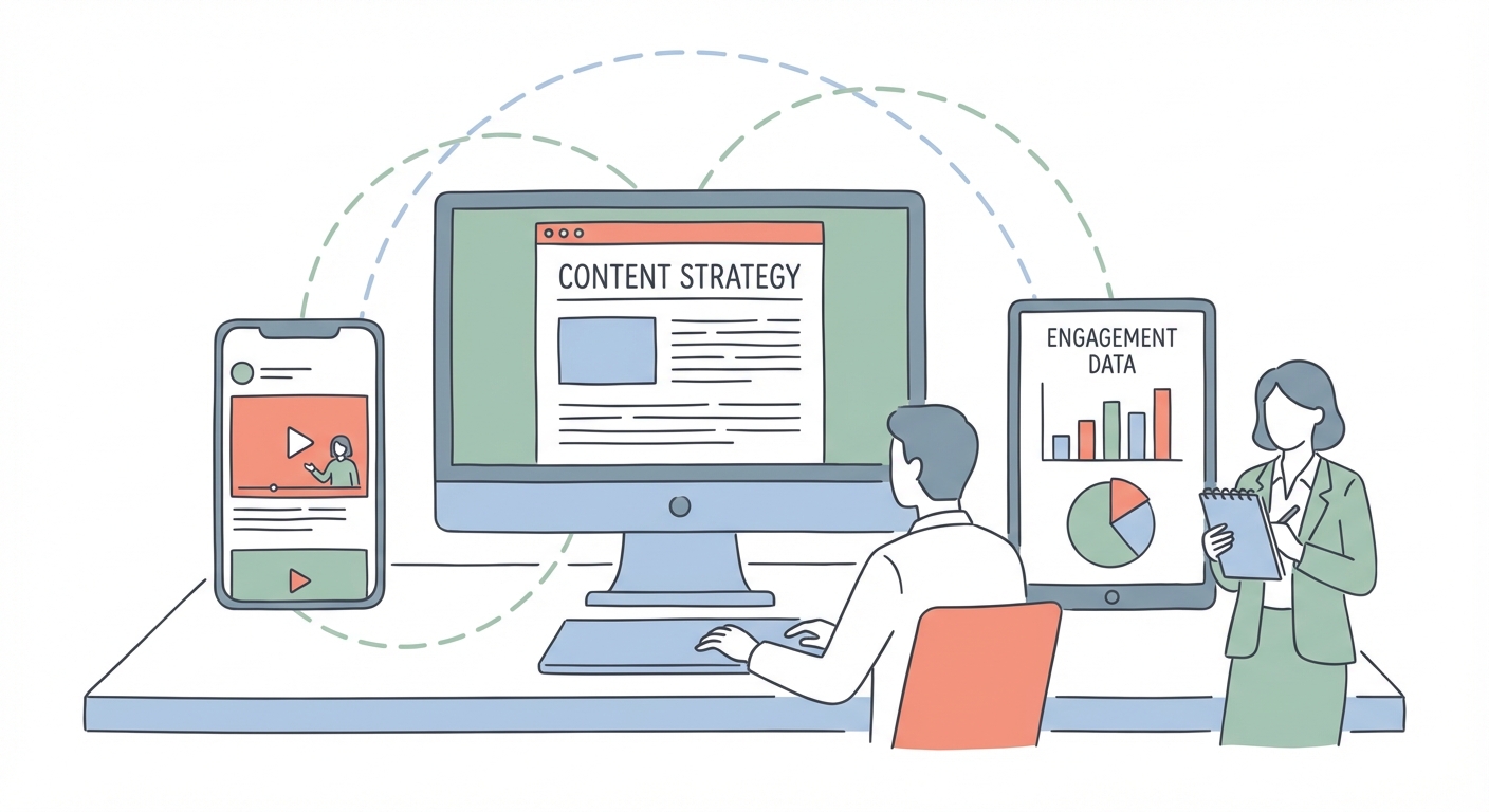
Optimizing CTA Placement and Design
So, you wanna make your call to actions, like, unmissable, right? It's not just about the words, but where you stick 'em and how they look. Think of it like decorating a storefront—you want people to come inside, don'tcha?
- Strategic Placement: "Above the fold" is still prime real estate, but don't ignore the bottom. I mean, not everyone sees it right away, but it's still important. For blog posts, CTAs should be kinda sprinkled throughout, not just at the end. Like, every few paragraphs, give 'em a nudge. Pop-ups, eh, those are tricky. Use 'em sparingly, or people will just bounce.
- Visual Appeal: That's important too.
- Colors: Do some research! What attracts the eye? What feels right for your brand? A good starting point is to research color psychology or simply ensure your CTA color contrasts well with the background.
- Button Size: Make it easy to click, especially on phones.
- Whitespace: Is your friend. Give that cta room to breathe!
Now that you know where to put 'em and how to make 'em look good, let's talk testing...
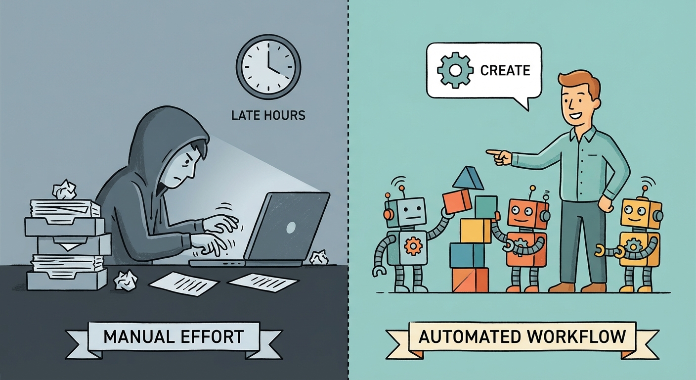
Leveraging AI Writing Assistants for Stronger CTAs
Alright, so you're thinking ai can whip up killer calls to action? well, it's definitely a new world, ain't it? I mean, who has the time to brainstorm endless variants these days?
- Generating Options: Ai writing assistants can quickly produce a bunch of cta options. Think of it like a brainstorm partner that never gets tired. For example, if you're in e-learning, an ai can generate ctAs for course sign ups.
- Data-Driven Insights: These ais can analyze data to figure out what language works best. What phrasing gets clicks? What makes people tick?
- Personalization at Scale: Ai can automate personalization based on user data. Imagine tailoring your cta based on a user's past behavior – pretty neat, huh?
Like, imagine a healthcare company using data to tailor a cta specifically to you. Are you still not convinced?
On we go to testing your CTAs!
Testing and Iterating Your CTAs
So, you've been slaving away, crafting these ctAs, right? But are they actually working? That's where testing comes in, and it's not a one-and-done deal. It's more like a constant tweaking process to see what really makes folks click.
- A/B Testing: Try out different versions of your cta copy. Does "Shop Now" beat "Discover Savings"? Only one way to find out.
- Button Colors: Seriously, it matters. Red? Green? Blue? Test different ones, see which one grabs the eye. A good starting point is to research color psychology or simply ensure your CTA color contrasts well with the background.
- Analytics are Your Friend: Keep a close watch on your click-through rates. Conversions? All that jazz.
Don't be afraid to make changes!
Bringing It All Together: The CTA Journey
So, we've covered a lot of ground, huh? From understanding what a call to action even is, to crafting words that sing, and then making sure they're seen and tested. Remember, CTAs aren't just random buttons; they're the vital links that guide your audience, drive conversions, and ultimately help you reach your goals. It's an ongoing process, so keep experimenting, keep learning, and don't be afraid to tweak things until they're just right.